Instagram in 2026: Which image formats generate the most reach?
You shoot in landscape. You've been doing it for years. You compose carefully, you take care of the light, the framing is yours. And then you get to Instagram and the algorithm cuts out the best for you. It is not a minor problem: it is the central tension between photography as a discipline and social networks as a distribution channel. And in 2026, that tension has become more demanding than ever.
The real cost of publishing horizontally
More than 90% of views on Instagram occur from a mobile phone, vertically. When you upload a photo in 16:9, the platform accepts it, but charges you a silent price: your image takes up only a narrow strip of the feed and the empty space is filled by Instagram with content from others. Your photo competes on the same screen with another image that, if it has more color or more contrast, wins. The user passes you by before your work has had a real chance.
Added to this is the most important change of the last year: in 2025 Instagram eliminated the square grid and started showing the profiles in 3:4ratio. Uploading in 4:5 or 1:1 can now appear cropped directly in your profile. For maximum control over how your feed looks, it's best to stick to the 3:4 ratio, although if you want to take up as much space as possible in your feed, 4:5 is still an aggressive option — always taking into account how the grid preview will look.
What format to use and when
The logic is simple: always try the most vertical crop possible that preserves the relevant visual information. 3:4 (1080 x 1440 px) first — fits the new grid and takes up a lot of screen. If the framing requires it, 4:5 (1080 x 1350 px) — is still the format with the greatest presence in the feed. And only when there is no other compositional option, 1:1.
There is a critical technical detail that photography forums constantly repeat: going to a higher resolution than the recommended one does not improve the image, it worsens it. Instagram works with a maximum width of 1080 px; Overcoming that triggers more aggressive compression that degrades sharpness. Exporting at exactly 1080 px wide, in color profile sRGB and with high export quality is what really makes the difference. Also avoid screenshots and take care of the edges: compression artifacts tend to appear more at the margins of the image.
Specific tips that work (according to photographers who have already been through this)
This is what the community has learned through trial and error:
- One horizontal photo is two or three vertical ones. Shooting horizontally with the mindset that two or three different vertical crops can be extracted from that file maximizes the performance of each shot without forcing a change in the way you shoot. More content, same effort.
- The white border as an honest solution. When cropping destroys the image, adding a white (or black) frame allows you to publish in the correct ratio without losing any elements. It's more elegant than automatic black bars and has become a recognizable style in many photography feeds.
- Carousels in "Mixed" mode. Instagram allows you to publish horizontal and vertical photos in the same carousel by activating the "Mixed" option in the ratio selector, without the need for external apps or forced cropping. Ideal for series or reports where both orientations coexist.
- 10% of the edges are a risk area. Important elements — faces, text, logos — should not be in the outer 10% of the image, as that area is more prone to automatic cropping and compression artifacts.
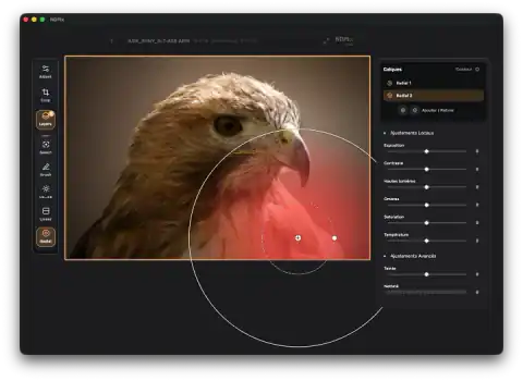
- Apply the target crop before editing, not after. Setting the output ratio at the beginning of the editing flow in Lightroom allows you to see and adjust the exposure, color and touch-ups already in the final frame, avoiding surprises when exporting.
- Stories: central safe zone. A photo in 4:5 or 3:4 is almost compatible with Stories (9:16). The excess margin above and below is usually resolved by opening the frame slightly. If there is no space, the central area of 1080 x 1610 px is the safe zone where any relevant elements should be.
The change that matters most: disassociating shooting from publication
None of this requires you to stop photographing horizontally. Around 70% of active photographers on Instagram still shoot horizontally most of the time, and that doesn't mean they disappear from the feed. The key is mental: knowing when shooting which area of the image will survive the crop. It is an editorial decision, not an artistic concession. The same thing a photojournalist does when he knows if his image is going to be on the cover or a side column.
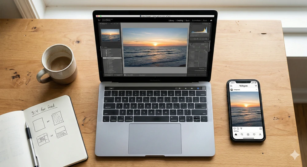
In practice, the entire flow can be solved from the phone: an editing app to select the output ratio, add borders if necessary, and export versions for feed and Stories in the same step. The key is to integrate it as part of your regular publishing flow, not treat it as a last-minute fix.
Summary
Situation Recommended format Horizontal photo with central subject 3:4 or 4:5, cropping the sides Horizontal photo with information on the edges White frame + 4:5 or 3:4 ratio Mixed series (horizontal and vertical) Carousel in "Mixed" mode Adaptation to Stories 4:5 base + minimum edge opening Image that does not support 1:1 cropping as a last resort The platform changes. The formats that work today may not be the same in six months — it already happened with the change from the square grid to 3:4. What doesn't change is the principle: more screen busy, more likely someone will stop.